

It’s summer (well looking outside, its currently raining!) and it seems I haven’t blogged for a while!
This week’s project is my summer project; “to create a typeface using inspiration from whatever you find”. Having been told to stay away from the computer for this project, we were asked to find something over the summer that inspired us.
I had started this project a couple of weeks ago, before I went on holiday. I was really set on my idea even though it isn’t the easiest one to explain!
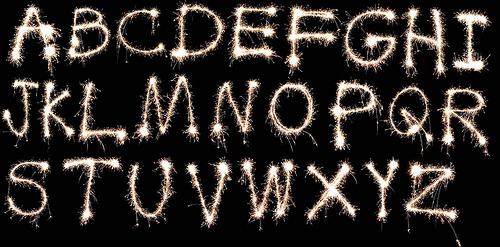
I had the idea of using torches (or sparklers if I could get my hands on them at this time of year!) and using them to draw out each individual letter of the alphabet. I would then take photos, changing the shutter speed and exposure time on the camera so the letters would appear clearly on the dark background. The final result would be similar to the photograph below.
After a discussion with a friend (and fellow course member) I decided to make my idea a bit more creative and we discussed how I could alter my original idea. However I decided to go back to the drawing board because, whilst I was on holiday, I came up with a fresh, new and exciting idea!
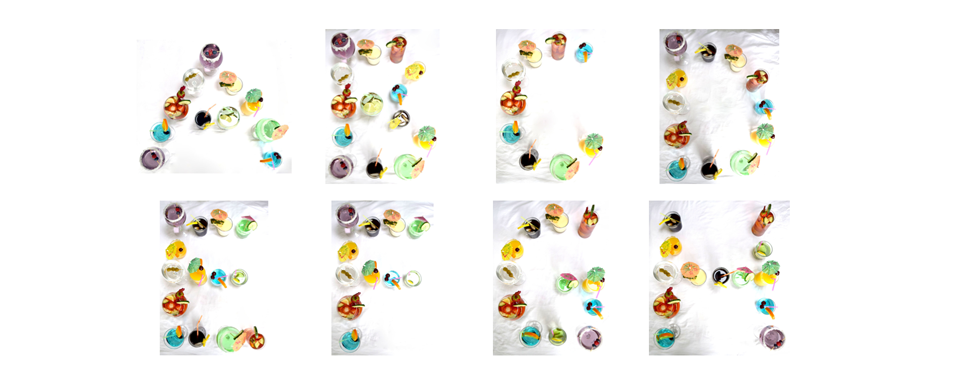
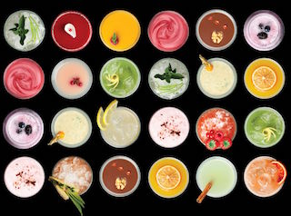
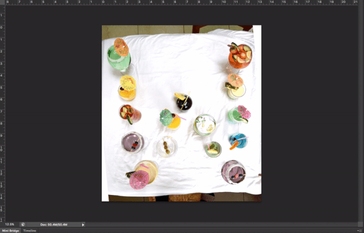
Given the fact that the typeface had to be inspired with what we found around us, I chose the theme of cocktails! After researching different types of cocktails (I fancied a few in neon greens, pinks and blues) I came up with a list that I could use to create my typeface. Similar to the image below, I would take photographs of the cocktails from above to make the lettershapes.
With help from my mum and sister (thank you, thank you!) we created non-alcoholic equivalents- these were mainly made from water and a splash of food colouring! Who knew that soya milk could be a substitute for a Pina Colada??
Props, such as the cocktail umbrellas and chopped fruit certainly helped here- I didn’t just want the cocktails to look like different coloured drinks, I wanted them to have character.
So yesterday afternoon all three of us clubbed together and created cocktails (which you can see below!). It did take a long time to reposition the cocktails to form each letter shape- especially trying to avoid risky spillages! But in the end we got there :-)
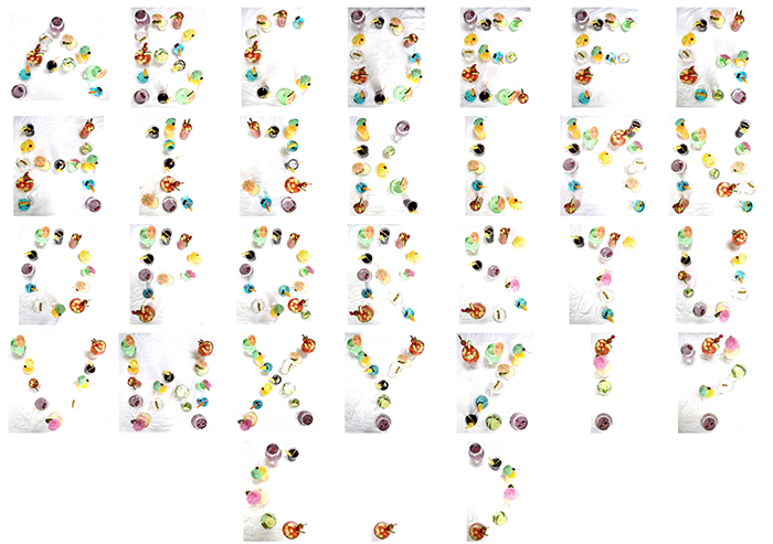
After taking the photographs of each letter, as well as an exclamation mark, question mark, comma and set of brackets- I set to work editing the photographs. I wanted to make the colours more vibrant, though it could be argued that the photos are now too exposed- but this made the cocktails pop from the stark background.
As expected, touching up all the photos took its time. There were some areas where it looked too unrealistic to remove all background shadows, hence why there are some shadows on the majority of photographs.
The last part of the project was to spell out the words ‘The Disciples of Design’ as this is the university’s design website, which you can see below.
Overall, I have really enjoyed this project- it’s been a good experience and I've never undertaken anything like this before!
