This project was a brand extension for Saxa Salt, a common household name.
Its bright red letters make it clearly stand out, not only in the supermarket, but also in the kitchen cupboard. Saxa also uses secondary branding of blue and (more commonly) green to distinguish between the varieties of salt it produces.
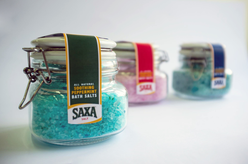
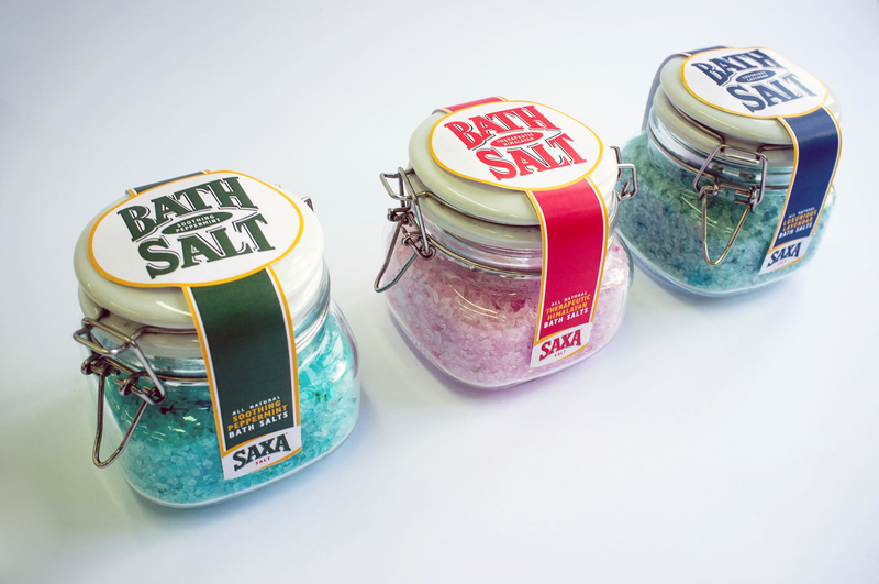
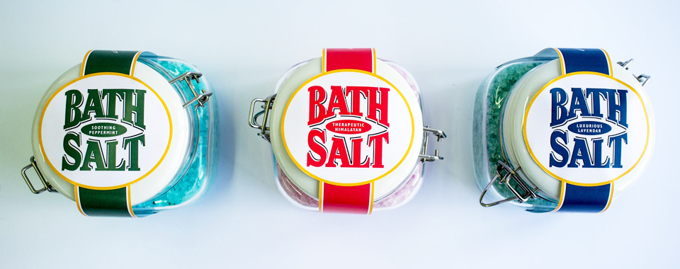
Taking inspiration from traditional healing methods of Salt Baths, Saxa branches out. No longer just making products for the dining table, Saxa wants their customers to be able to unwind and relax in their soothing salt, too.
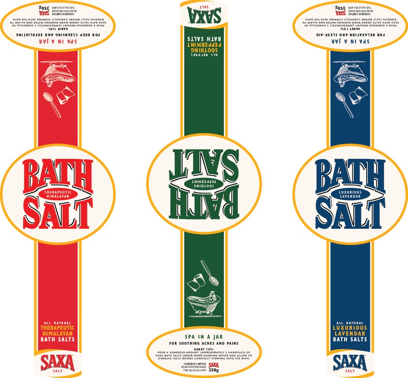
Available in three varieties; Soothing Peppermint, Therapeutic Himalayan and Luxurious Lavender.