


This week explored how typography and letterforms can be used to effectively communicate an idea.
The key idea behind this was to get us to look at how different letterforms and font families fit together and how different styles can be used to represent an idea.
This time I wasn’t given a word to look at, it was up to us to look at the different example fonts we had been given and find out ways that the letters would fit together and represent out idea.
Some of my initial ideas included the word ‘Music’ with the first and last letters edited to create headphones to surround the word. I also looked at the word ‘Stolen’ with a drawn figure pushing away the ‘N’ at the end of the word. I also used the word ‘Saint’ and modified the ‘T’ so that it looked more like a Christian Cross.
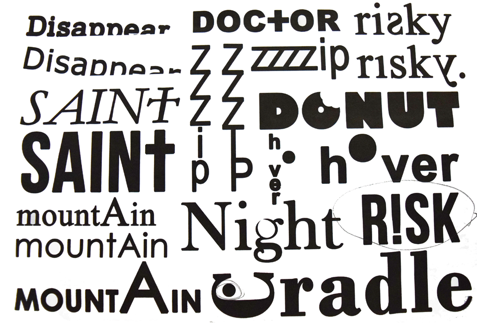
However, after attending a feedback session I found that these ideas were not quite what the brief has specified. I therefore removed the drawn elements of the initial ideas that I had and looked more into how some of the letters related to the word they were representing.
A prime example of typographic interpretation that everyone recognises is the FedEx logo. The way that the ‘E’ and ‘X’ are positioned together creates the hidden arrow within their logo.
After exploring further ideas I moved onto the computer- allowing myself to visualise my ideas and experiment with different fonts in an easier way than just sketching them.
After further development, my final idea centred on the word ‘Zip’. I experimented with the positioning of this word, knowing that my final format would, again, have to be presented onto an A2 sheet. I decided to repeat the letter ‘Z’ from the word and overlap them so that they would create a pattern mimicking the layout of an actual zip. I then added the final two letters so that they would form the shape of zip handle.